
'DESTROYER,' PART 1
For sixty years, Keen Marlowe has been a superhero. Now Marlowe is dying, but before he goes, he intends to leave the world a safer place. If that means murdering every super-villain he can, so be it. They don't call him Destroyer for nothing.
Cory Walker's art is also a nice contribution to the story, adding a level of simple line detail that is a more comic book like, rather than realistic, which gives the action scenes a gritty feeling. Walkers style also could elicit a reaction from a reader during those action scenes due to the fact that he doesn't have to hold back the description of what happens when Destroyer punches someone in the face. Walker shifts well from big time action scenes to small character moments, like the conversations between Keene (Destroyer) and his wife, Harriet. Read Full Review
Ultimately, whether you've read it or not, you probably already know if you'll like Destroyer based upon your general feelings towards Kirkman back catalogue. Not to pigeonhole the author - as books like Walking Dead prove his ability to tell diverse stories - but Destroyer is very much a cousin to books like Invincible or even Battle Pope. Whether that's a good thing or a bad thing is entirely up to you. Read Full Review
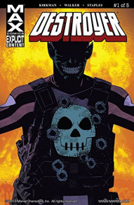
Walker's artwork is crisp and slickly stylized. His efforts here remind me of the kind of energy and personality one can find in Cully (Black Lightning: Year One) Hamner's art. He conveys Keene's age quite well without making him seem feeble. I like that he crafts him as a stout, solid powerhouse of a man. Walker's design for the title character's wife represents a nice balance of ordinary and extraordinary. My one qualm about the visual side of the book (aside from the gore) is the actual design for the title's protagonist. I know it's in keeping with his classic look, but it's so Skrull-like, I wonder if it might not confuse some of Marvel's newer readers who are unfamiliar with this obscure property. Read Full Review
Be the first to rate this issue!
Click the 'Rate/Write A Review' link above to get started.

 Prev
Prev